top of page

"THE GREAT GATSBY" COVER REDESIGN
After reading this book, I was inspired to create my own cover of the book in a modern art style that incorporated the symbolism present in the book in a visual way.
The Great Gatsby Cover Redesign: Welcome
I never understood the connection between the cover of the Gatsby book I read and the contents of the book itself.
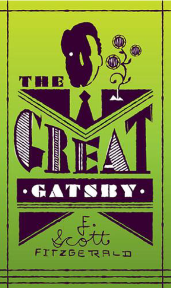
I felt that the image on the most common book cover was unclear in what it was attempting to communicate. I looked at other book covers as well to see what covers I liked and what I didn't. I really appreciated the covers that made the title text a main part of the cover, either by having bold font choices or by hand-lettering the words into the entire design.


The Great Gatsby Cover Redesign: Image
I started by listing major events and symbols that happened in the book that I could translate into an iconic image. I then sketched a few basic ideas on paper and decided from here which I wanted to digitize.


The Great Gatsby Cover Redesign: Image
I then took my favorite three ideas and made just the front cover digitally for each idea.
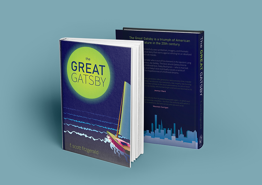
After looking at these mockups, I decided to pursue the first design with the green moon and the boat. I thought that the cover with the car did not have a functional color palette, and that the event depicted would spoil a major event of the book. The other design with just the silhouette was too basic and impersonal. The boat cover had a cohesive color palette and had prominent symbolism from the book without spoiling anything.
The Great Gatsby Cover Redesign: Text
 |  |  |
|---|
The Great Gatsby Cover Redesign: Image
I then moved forward with refining the text and design of the cover, as well as fleshing out the spine of the book and the back cover. While the front cover was the main graphic, I did want the back cover to have graphics as well that gave more context to the story's setting.
The Great Gatsby Cover Redesign: Text

The Great Gatsby Cover Redesign: Image
The final book cover was a modern design with clean, prominent text that is central to the design itself. The green light is a main symbol of the book, as well as the image of a boat. The composition and lighting helps to convey the mood of the book itself.
I really enjoyed this project! It was inspiring to translate my love for this book into a representation of the book that I hope others could connect with.
The Great Gatsby Cover Redesign: Text

The Great Gatsby Cover Redesign: Image
bottom of page